Executive Dashboard
With the increase in demand for strong cybersecurity practices, customers wanted a high level summary they could bring to board meetings to give their leadership a pulse check on how their cybersecurity practice was doing.
Industry Cybersecurity
Process Requirements Gathering, Initial Research, Workshop, Sketching/Wireframes, Mockups, Release V1
Tools Figma, Google Workspace, Zoom
Role Senior UX Designer
01 PROBLEM DEFINITION
The current platform experience offers a lot of detailed data about compliance and risk for cybersecurity analysts but doesn’t have a place that sums up this information for executives. To provide value with the representation of this information, what cybersecurity data do board members care about?
02 RESEARCH
Our team didn’t have a traditional product owner to solidify requirements for this feature request. My only direction was to “design a dashboard for executives”
To make sure we were presenting information in a meaningfulway way I broke up my initial research in 3 parts:
Spoke with colleagues, our internal subject matter experts, on what they were hearing from customers
Looked through customer request tickets, what customers were asking for
Refreshed myself on good dashboard design
Samples of dashboard design inspiration
03 WORKSHOP
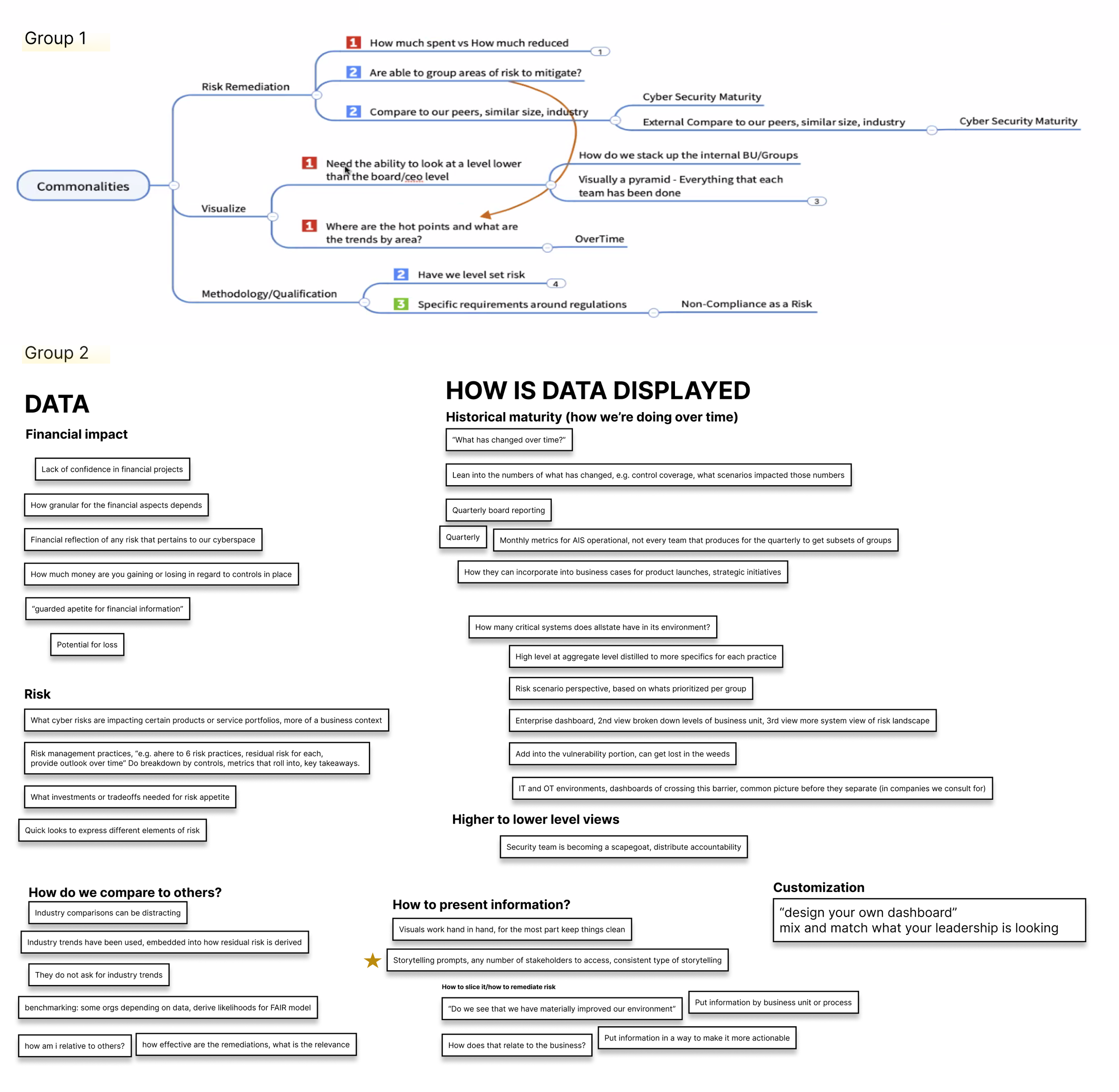
10 customers joined our executive dashboard workshop.
I split the participants into 2 groups and led them through an affinity mapping exercise.
To get the discussion started I had our participants put themselves in the shoes of an executive. They were given a few statements to start to help generate ideas. After the idea generation, we grouped the ideas by commonalities and titled the groupings to uncover themes.
To wrap up, we came back together and had a discussion about what each group came up with. The 3 main commonalities:
How do we compare to others?
Financial impact vs risk
Ability to “drilldown” into the high level information presented to executives for individual contributors to take action on
04 WIREFRAMING
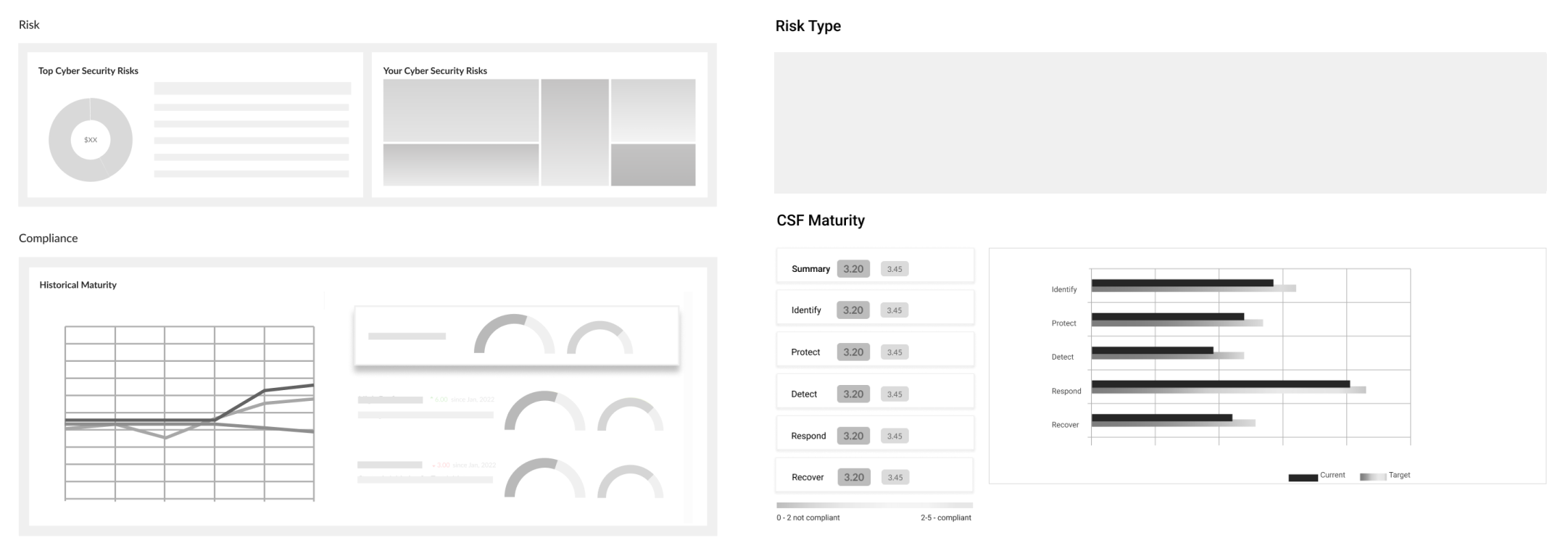
The objective of creating these quick wireframe concepts was to determine which components of summary level information to put on the dashboard, play around with their order, and try out different graph types.
Another agreed upon takeaway that came out of the workshop was the effectiveness of storytelling for our customers. When creating these wireframes, I was mindful of how the design elements could work together to tell them a meaningful story of their cybersecurity landscape.
05 Mockups and evolution of feature
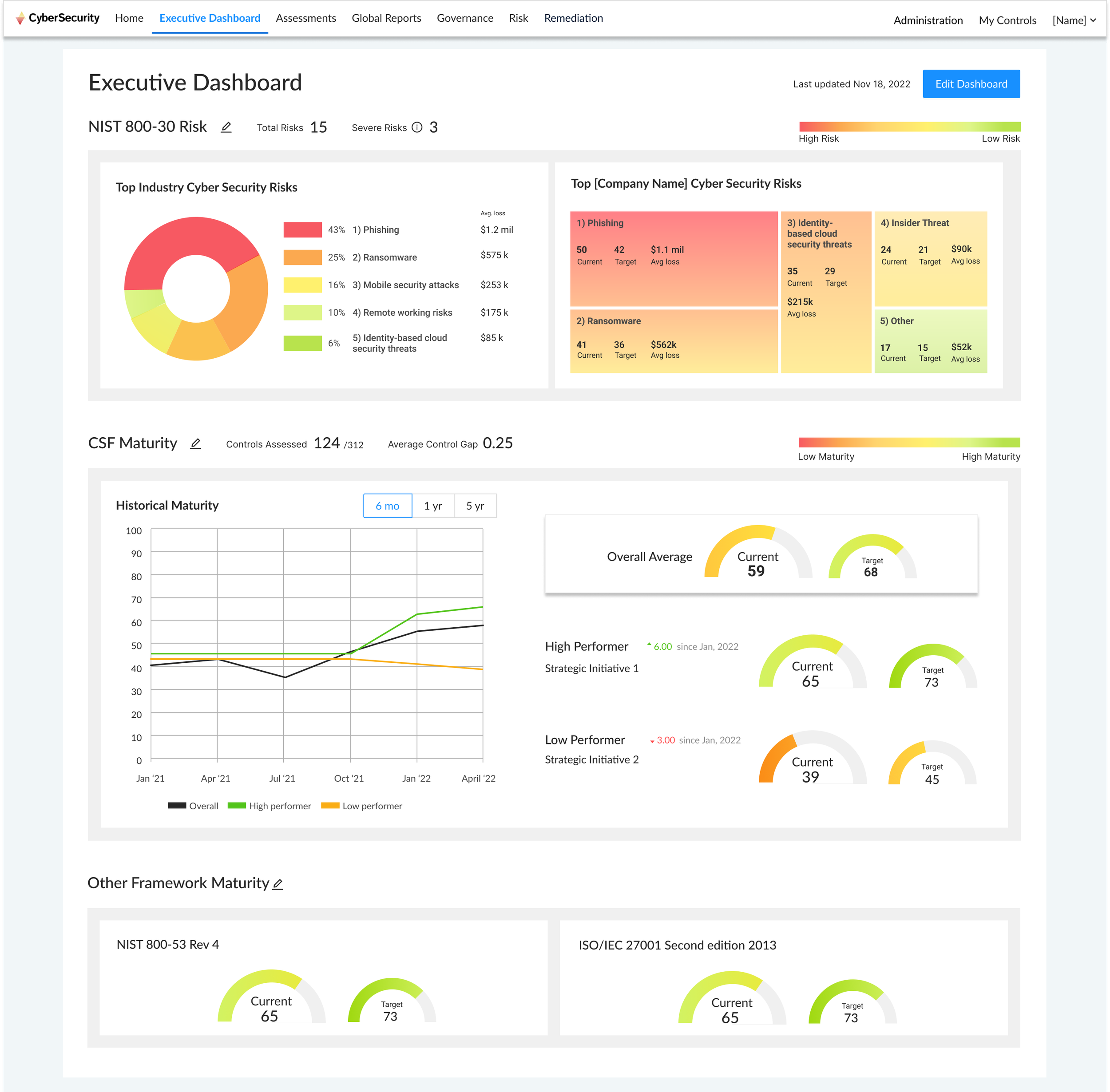
Instead of doing another round of user research to validate the design resonated with our executive users, we decided to gain user feedback once the dashboard was live in platform. Since the feature entered our product in early 2023 it has gone through two iterations based on customer feedback and to compliment our evolving product.
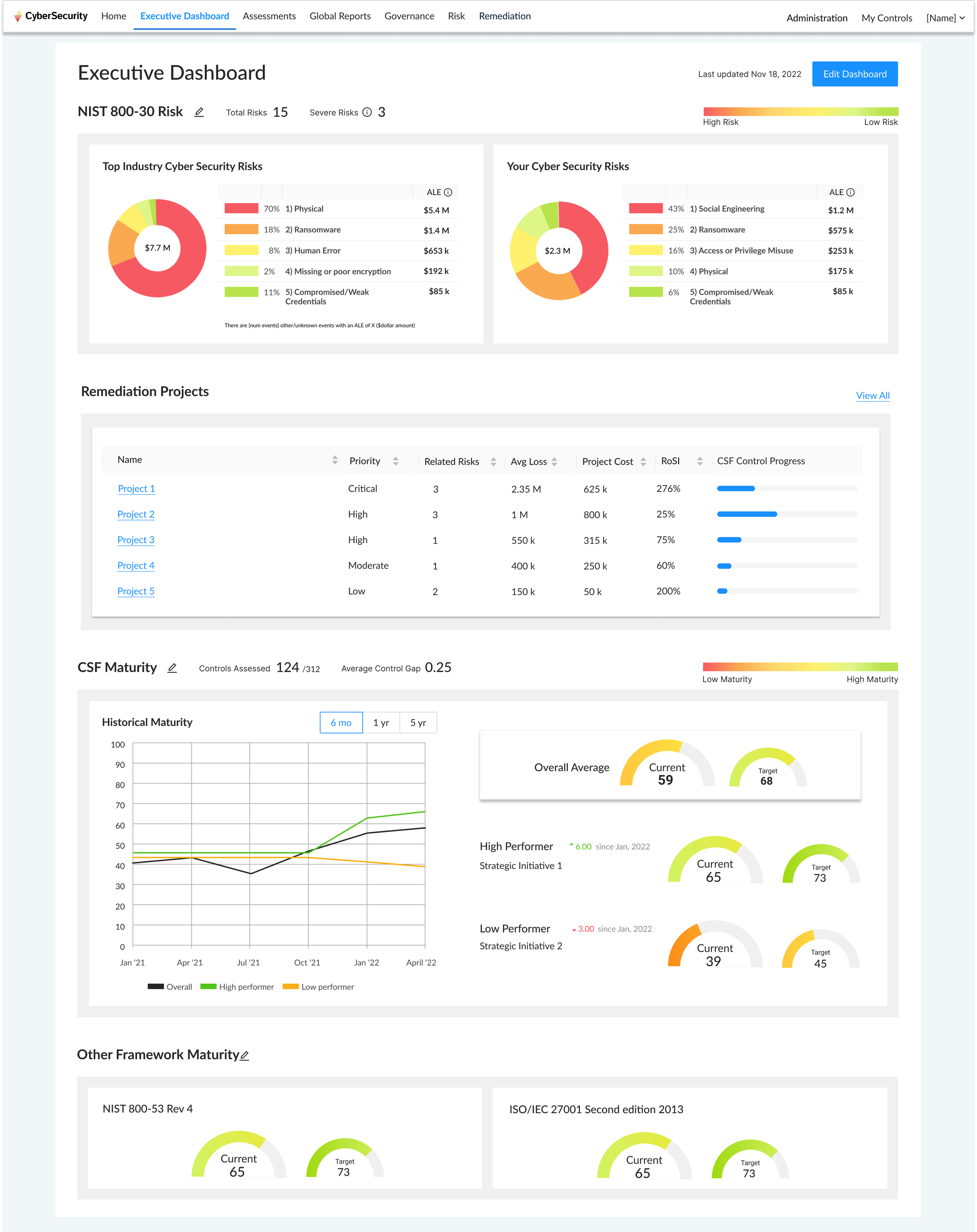
For our second version we changed the cyber security risks treemap graphic to a donut chart for users to more easily compare stats. We also added in a section for remediation, as that feature arrived later in 2023.
In the last version we had to make visual adjustments to match our UI redesign. This involved switching to left rail navigation and a slight change in our design system in terms of color and font sizes to be more consistent with our marketing/branding.


